Following from my last post, a few people emailed me wanting to know how to go about choosing a style for their own home. Frankly that is a difficult decision. My gut reaction is to advise people to go with what your heart sings. But then that begs the question: what if you don't know what your heart sings or if it sings to every style? LOL.
As I mentioned in my last post, my own style has evolved into what I now know I absolutely love and what suits and reflects everyone in our family. How did I come to this realisation? Honestly, from reading and devouring home interior magazines. I soon found looks that I liked, simply by being exposed to them and seeing them put together professionally by an interior artist. From there, I developed my own confidence and started to play with looks. Looks which I think suit my family to a tee. Looks which people who know me know that that is "so me"!
Now, if you don't want to spend all that money buying interior magazines (and they can be quite pricey) and want an even more straight forward (and free) way to finding your decorating style, perhaps an online quiz is for you. Try this out and let me know how you go. Perhaps it will reveal something about your own style you did not even know existed. Have fun folks finding your "look"!
http://www.bhg.com/decorating/decorating-style/
Tuesday, May 31, 2011
Sunday, May 29, 2011
Our global inspired home
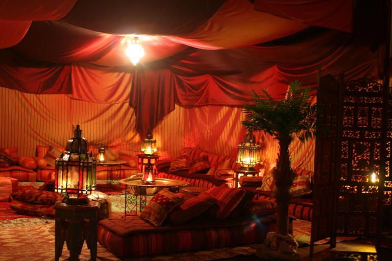
A few people have asked me what decorating styles inspire me, which looks make my heart skip a beat and hold my breath. To be honest, I have changed a lot in terms of what I like in home styles. The furniture in our current home is a collection of so many different styles as I wandered about, finding what makes my heart sing. Yet I still have to say that while it looks to be an eclectic mix, all the pieces somehow work to convey a sense of coziness and warmth. My house is never a museum and although it is filled with things I loved, it is ultimately a home where people can literally put their feet up and find comfort and even solace.
But building a new home means being able to start fresh, and while I have loved so many of the pieces we have in our current home, some will have to go to new owners. Our new home will not just reflect my style, but also my husband and kids. They have been very involved in the process of choosing colours, styles and even their own furniture for this new home. And so yes folks I am reigning in my usual control nature to bring more balance to our new home. I know some of you are shocked by this admission. Trust me, it wasn't easy!
For instance, anyone who knows me knows how much I love wood. But hubby made a request from the very beginning of this build for a leather uphostlered king size bed as he keeps knocking his knee into the wooden foot of the bed and of course hurting and bruising it in the process. He wanted something softer. Of course my control nature said no way! Upon realising that I need to give a bit, I went about looking for that perfect leather bed for hubby. And many months later, we found it at Forty Winks. It is still quite minimal which is important for me and hubby can bump into the bed all he wants and it won't be an issue. Win, win for all involved.

So what is this style I am alluding to which is able to marry all of our styles? I call it the minimalist, global style. My family and I have had the fortune to travel quite a bit and in our travels we have witnessed the beauty of people's lives from all over the world. We want that reflected in our new home. We have picked up gorgeous handmade rugs from Turkey, and wooden accessories, a beautiful antique painting, and a camel hair runner from Syria on our last trip. We also have things we bought and things friends have given us during our 4 year stay in Malaysia I have items my parents and I bought from Vietnam, reflecting our heritage. But I also have Morrocan laterns, tangines, candle holders, cushions I have collected throughout the years. I also have a love for ornate Chinese dishes and vases in my possession. And we have solid mahogany furniture from Indonesia. This is what we are bringing into our new house and for me this definitely represents who we are.
But at the same time, I love the restrained, minimalist look. So while I want our love of the world to be reflected in our new home, I don't like our house full of clutter. So there it is- the look I love and the inspiration in our new home is the minimalist, global style.
While I can't show you photos of how I would I style the rooms just ye t(perhaps in 2-3 months time after we have moved in), I can include other global style to inspire you. Enjoy folks!


Friday, May 27, 2011
More decisions made
After hunting around for "the carpet" we finally settled on the Norman Ellison "anti-allergen" wool range from the Carpet Man. Thanks Fadzilah for pointing us in that direction. We got a few other quotes from other carpet stores, but in the end, we decided to go with them because they had the carpet which we thought was a perfect balance between what I needed and what Hubby wanted. The kids and I suffer from horrible hay fever and this carpet is guaranteed to be anti-allergen. It is also a textured loop which I love. For hubby, it had to be wool as natural is very important to him. And with wool, it will give us that great appearance even after many many years. Besides we were happy with the sales rep who was patient, offered us excellent advice and seemed to know what he was talking about.
So here's the photo of our chosen carpet:


I love these resort style fans- very retro, yet funky and modern at the same time. The kids aren't fuss about them so luckily we only got two of them- one in the family room and one outside under the alfresco area.


So here's the photo of our chosen carpet:

The colour is called Fawn and while hubby and I liked one of the darker shades, we thought that we've got enough dark things happening: walls, floorboards, dark wooden furniture... so we need light carpet to balance things out a bit. At least that's another decision done! Hurray!!!!
Now, let me share some other photos I took while I was at the house the other day.


These satin light switches are so pretty. We got most of the downstairs' switches in this satin range. Upstairs is the simple, white utilitarian ones!

At the top of the stairs is the glass partition. It looks yucky at the moment but I am sure that once the cleaners are done with it, it shall be sparkingly beautiful! Oh the balustrade needs to be stained yet...and of course it's a darkish one!

Our youngest boy will have the best view in the house. This is what he gets to wake up to every morning. Bliss!

An updated photo of the house from a frontal view. The garagedoor is on, Colorbond evening haze, and the render is basically done, but the two pillars there with the light fittings still needs to be painted- Taubmans Canyon Black (which is supposed to be a Charcoal Grey). And they got a bobcat in yesterday to clean up the outside. So it looks pretty neat, without all that construction mess everywhere. I can't wait until they clean the inside!
Thursday, May 26, 2011
Yippee!!!

Folks you have made my blog such a success- I now have over 1000 hits due to your interest!!! Thanks for being part of this experience. And remember to keep throwing those comments and advice my way. MWAH everyone! Until the next post, friends!
Wednesday, May 25, 2011
And we've got lights
Hubby met with the electrician on site to hand over the light fittings we bought to be installed. There aren't too many as the majority of fittings are either fans or downlights supplied by Plantation Homes. It's a shame they won't install pendants (apparently they are too fiddly for them to bother with) so we will have to do that after handover. Luckily we've only got one- in the dining room.
We came back on site a few hours later to have our own walk through of the house and to see how the electrician was getting on. When I walked into the house today, I honestly thought- how in the world are they going to get this house absolutely spotless? There is so much mess, with garbage and dust everywhere. Don't believe me- here's a peek:

When I pointed out the mess, along with other little things I felt were not done properly, hubby reminds me that it is a construction site and all this will be cleared and cleaned before our practical completion inspection. And I know that even little paint issues I found in corners, here and there, will all be sorted out!
Speaking of paint.................here is the red feature in the kitchen:


It is really hard to tell from a photo I know, but this is perhaps the closest I can do. Besides, when there is the play of light on the colour, the shade shifts quite a bit. Some people have reacted strongly to the colours we have chosen, saying "hmm, they are bold colours for main walls". Admittedly, they are not your white or cream walls, but we didn't want that. And we definitely are not into trends. These colours make our hearts happy (okay, they make my heart happy). And I like to make my heart happy and sing!
Now I will stop with the commentary as I feel this posting is becoming a PhD on house-building; I will simply let you enjoy the photos. Have a good night/day friends!


We came back on site a few hours later to have our own walk through of the house and to see how the electrician was getting on. When I walked into the house today, I honestly thought- how in the world are they going to get this house absolutely spotless? There is so much mess, with garbage and dust everywhere. Don't believe me- here's a peek:

When I pointed out the mess, along with other little things I felt were not done properly, hubby reminds me that it is a construction site and all this will be cleared and cleaned before our practical completion inspection. And I know that even little paint issues I found in corners, here and there, will all be sorted out!
Speaking of paint.................here is the red feature in the kitchen:

What do you think folks? At first I had the same reaction as yesterday when I first glimpsed it through the tiny available space in the window- it's way too dark. But having walked back and forth, viewing it from different angles and watching the light play with the shadows, I have come to the conclusion that I really like it. It is not a show-stopping fire engine red, but a maroony red. For those who have been inside my current home, it is exactly the same shade of red as my feature wall in the family room. Funny I didn't realise that when I first chose the colour at our colour selection.
Most importantly, Hubby likes the colour too! Whew!!!The bright reds would have been too stark, according to him; this blends in better and even balances the earth tones we've got happening around the place.I guess I was nervous about the colour (still am a bit I admit) because we've got such dark cabinetry (laminex burnished wood) and we also want dark floorboards (coffee bamboo). Let's hope that once everything is in, the house won't appear dark and depressing!
Here is the red colour inside the niches-

Now imagine a tall, black vase with white orchids in the niche. The red is called Ruby Rose by Taubmans if anyone is interested. Now to give you a better idea of the main internal wall colours here it is:

It is really hard to tell from a photo I know, but this is perhaps the closest I can do. Besides, when there is the play of light on the colour, the shade shifts quite a bit. Some people have reacted strongly to the colours we have chosen, saying "hmm, they are bold colours for main walls". Admittedly, they are not your white or cream walls, but we didn't want that. And we definitely are not into trends. These colours make our hearts happy (okay, they make my heart happy). And I like to make my heart happy and sing!
Now I will stop with the commentary as I feel this posting is becoming a PhD on house-building; I will simply let you enjoy the photos. Have a good night/day friends!
 |
| butler's pantry with sink |
 |
| Internal clear wooden door- this is one of the doors to the "library" |

Internal wooden door- this is to to our master bedroom

Our alfresco with the resort style ceiling fan- love the look of it!

And my beloved round vanity bowls in the master ensuite- imagine red (or burnt orange or turquoise) accessories contrasted with the white tiles, white cabinetry, and charcoal grey vanity bench
Tuesday, May 24, 2011
Seeing a very dark red!
I dropped by the house today and couldn't get in again as it was locked up; however I did attempt a sneak peek inside and noticed that they have painted our feature colour behind our kitchen glass splashback and the niches. And oh boy, it is much darker (more maroon actually) than I thought...Hmm, honestly I am not sure if I like it or not. Mind you I will have to have a good look at it tomorrow when I drop by to meet with the electrician, but that little peek did not impress me at all. Perhaps I have made a mistake with wanting that wow factor and going with the red feature. But then again perhaps once the glass is on and the furnishings are all in, everything will tie together. Well if I don't like that colour I only have myself to blame as I pushed for it! Anyhoo, I will post photos and let you folks comment. Till then, enjoy life folks!!!
Sunday, May 22, 2011
The end is near
Every day we visit the house, we can feel the end is very near. Although it is lock up stage, I managed to sneek a peek (in between all the goo on the window) and noticed that the internal painting for the main walls has been completed. The painters need only paint the feature colour behind the glass splashback and in the niche. Also the external feature colour of charcoal grey still needs to be painted, along with the door. I believe by tomorrow afternoon all this should be done as the electrician is due to come and install all the light fittings this coming Wednesday!! Then it's just the plumber who will finish installing all the fixtues (1-2 days). Then I believe the house is complete and it's time for the cleaners to come and give it that lovely glossy finish it deserves. In the meantime enjoy these photos of the tiled bathrooms and the wall colour!


amira's shower with featured tiles and niche for her shampoo, soap, etc

The boys' shower with their feature tile

Our master bedroom with a bit of bold charcoal to draw attention to our shower. The paint colour looks really dark in this photo but it's not really that dark.Think 2 shades lighter.

The first coat of the paint colour. Can't wait to be able to work this colour into our furnishings...
Wednesday, May 18, 2011
Difficult choices
As I stated in my last post, I was going to dedicate this week to running around and getting quotes from a few places. So far I have sent our house plans to a few shutter companies for quotes. We are looking at getting aluminium shutters for our place as they not only look great (minimal, clean lines), but they provide that extra security we find important. When I first saw them in one of my home interiors magazines, I mentally told myself: If I build another house, I am getting these shutters. Since then my in-laws have had them installed in their farm as well as their new house and they love them. If you are not familiar with them, this is what they look like-


For more photos see http://www.guardianscreens.com.au/gallery.php. They will cost us a pretty penny, but I think in the long term, they will be worth it.
White seems to be a popular colour choice, but we think it will be too "stark" against our wam colour scheme. So we are probably going to go with a dark wood grain colour to tie it all in.
We also went to Carpet Court to check out their carpets and hubby, kids and I are torn between two styles. Hubby loves the Harlow range of New Zealand Wool carpet; he likes the idea that wool is natural, and that it has a reputation of aging gracefully and wearing better than synthetics. Originally I liked the Windswept Range of solution dyed nylon as it has a nice pattern and is quite plush to walk on. And solution dyed nylon also is fantastic for its colour retention as well as stain resistance. They are similar in price, so that is not an issue. It is more what we would prefer. I guess we have to make a choice soon so that we can lock it in. Kids like the Windswept range too for its plushness, so if we were to go with numbers that range would win. At the same time, hubby's views about the wool carpet are valid. I had a look online and I am leaning towards wool. Btw, they both look fantastic so it's really difficult to choose. Any ideas folks? Have you had either (wool or solution dyed nylon) and which one would you recommend?
I am also going to the Carpet Man tomorrow (in Salisbury) as a friend has highly recommended them. It doesn't hurt to see what else is out there and if they have the same ranges as Carpet Court, then to get another quote for price comparison. Any other carpet places we should look at before we make our choice friends?


Photos can be found from Vincent Security
For more photos see http://www.guardianscreens.com.au/gallery.php. They will cost us a pretty penny, but I think in the long term, they will be worth it.
White seems to be a popular colour choice, but we think it will be too "stark" against our wam colour scheme. So we are probably going to go with a dark wood grain colour to tie it all in.
We also went to Carpet Court to check out their carpets and hubby, kids and I are torn between two styles. Hubby loves the Harlow range of New Zealand Wool carpet; he likes the idea that wool is natural, and that it has a reputation of aging gracefully and wearing better than synthetics. Originally I liked the Windswept Range of solution dyed nylon as it has a nice pattern and is quite plush to walk on. And solution dyed nylon also is fantastic for its colour retention as well as stain resistance. They are similar in price, so that is not an issue. It is more what we would prefer. I guess we have to make a choice soon so that we can lock it in. Kids like the Windswept range too for its plushness, so if we were to go with numbers that range would win. At the same time, hubby's views about the wool carpet are valid. I had a look online and I am leaning towards wool. Btw, they both look fantastic so it's really difficult to choose. Any ideas folks? Have you had either (wool or solution dyed nylon) and which one would you recommend?
I am also going to the Carpet Man tomorrow (in Salisbury) as a friend has highly recommended them. It doesn't hurt to see what else is out there and if they have the same ranges as Carpet Court, then to get another quote for price comparison. Any other carpet places we should look at before we make our choice friends?
Thursday, May 12, 2011
Great customer service
The other day when we were onsite with the tiler, hubby and I noticed a huge dent in one of the window frames. I had my camera with me and snapped a photo of it and emailed it to our Construction Administrator who promptly replied that the SS is on top of it and has contacted the window company to rectify the issue.

No issues, no excuses- just we will have it fixed for you ASAP. And that is what I call great customer service. Good on ya Plantation Homes.
And the construction administrator also advised that our handover could be sometime late June, which means I need to start cracking the whip (on myself!!!). I haven't even started getting quotes for the shutters, concreting, decking, carpet, furniture, turf, pool, fencing etc. Next week, I will have a week off from my PhD and commit myself to running around doing all this. And who said building was an easy task :(
But right now I need to concentrate on my PhD as my confirmation (major assessment) is tomorrow. Prayers requested friends.
Friday, May 6, 2011
It's lock up time
Since, we've been back from our whirlwind trip, we've gone to the house a few times to check on it, but unfortunately it's at lock up stage and we couldn't get in (could never catch the tradies when they were there). So when we received a call from the tiler today to come to the house to confirm our feature tiles placement, hubby and I jumped at the chance.
OMG! Plantation Homes has definitely been busy at our place. All cupboards are in, stairs are in, even the kitchen bench is in. The tiler had laid most of the floor tiles and expects to be finished by Wednesday. And the painters were there and painted one coat on the main part of the render. And apparently he and his team need another week to finish everything. Then it's just the electrician, the rest of the fixtures (tap, sinks, shower roses, etc) and the house should be done in about 5 weeks! Honestly at the rate they're going, they might be done before that. They had at least 10 guys working on the house today.
So folks, here are the photos from our build:

I am liking the colours here- dark wood with light bench top with dark specks sprinkled around to tie it all in. Choosing colours is quite a scary thing as you are never sure how they will turn out. My advice folks- go with your gut instinct, colours that naturally please or draw you. For me, it's dark wood contrasted with white and red accessories. I am also so glad I went with the 80 mm stone bench top, rather than with the stardard 20mm. It does make a huge difference! Let's hope I will also like my red glass splashback!

In the laundry, we decided to go neutral with natural stone/tan colours as it is afterall the laundry. And really does anyone really want the laundry to stand out??

This is Amira's bathroom with beige/tan colour tiles and benchtop, contrasted with glossy white cupboards. Again we decided to go neutral here so that we change accessories to suit our moods/seasons/trends. The boys' bathroom and the guest bathroom downstairs have the same colour scheme; the only difference with these bathrooms are the featured tiles. The master bathroom is completely different in colour scheme because, well it can be and we want it to be a feature. I couldn't take a photo today unfortunately as only one roll of the floor tiles was laid, but the colour scheme is charcoal grey floor tiles with glossy white wall tiles. The double vanity contains grey stone benchtop with glossy white vanity cupboard doors. I've already bought red towels and bathmats to contrast the grey, a colour combination I love, not just with interiors but also clothes. Can't wait to show you guys the finished room!

This is the final render colour- field stone. But again the photo doesn't do it justice. It's a deep stone colour, with charcoal grey painted feature pillars.
Subscribe to:
Posts (Atom)